
Rebrand - Clif
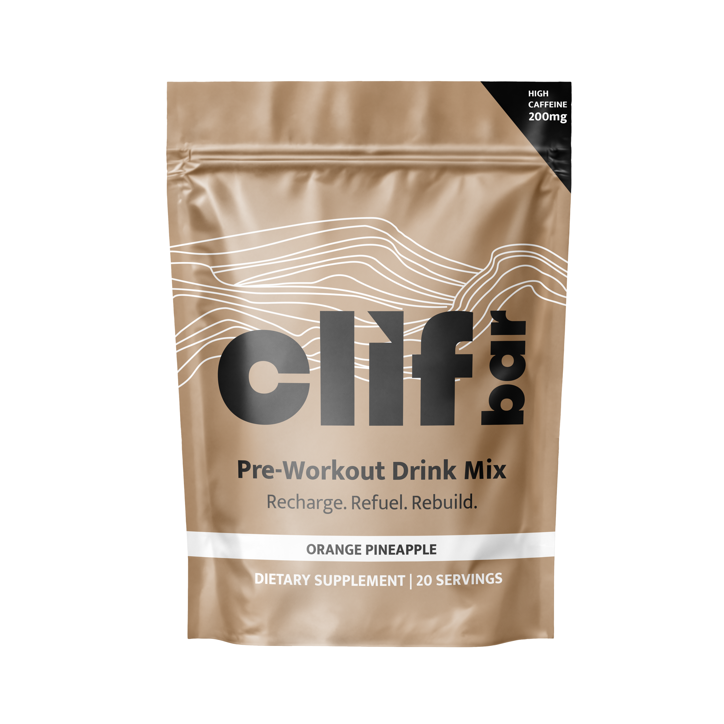
For the athletes who want a delicious and healthy fueling system to sustain their energy and improve their performance, Clif performance is reinvented to recharge, refuel, and rebuild their bodies throughout every phase of training.


Design process
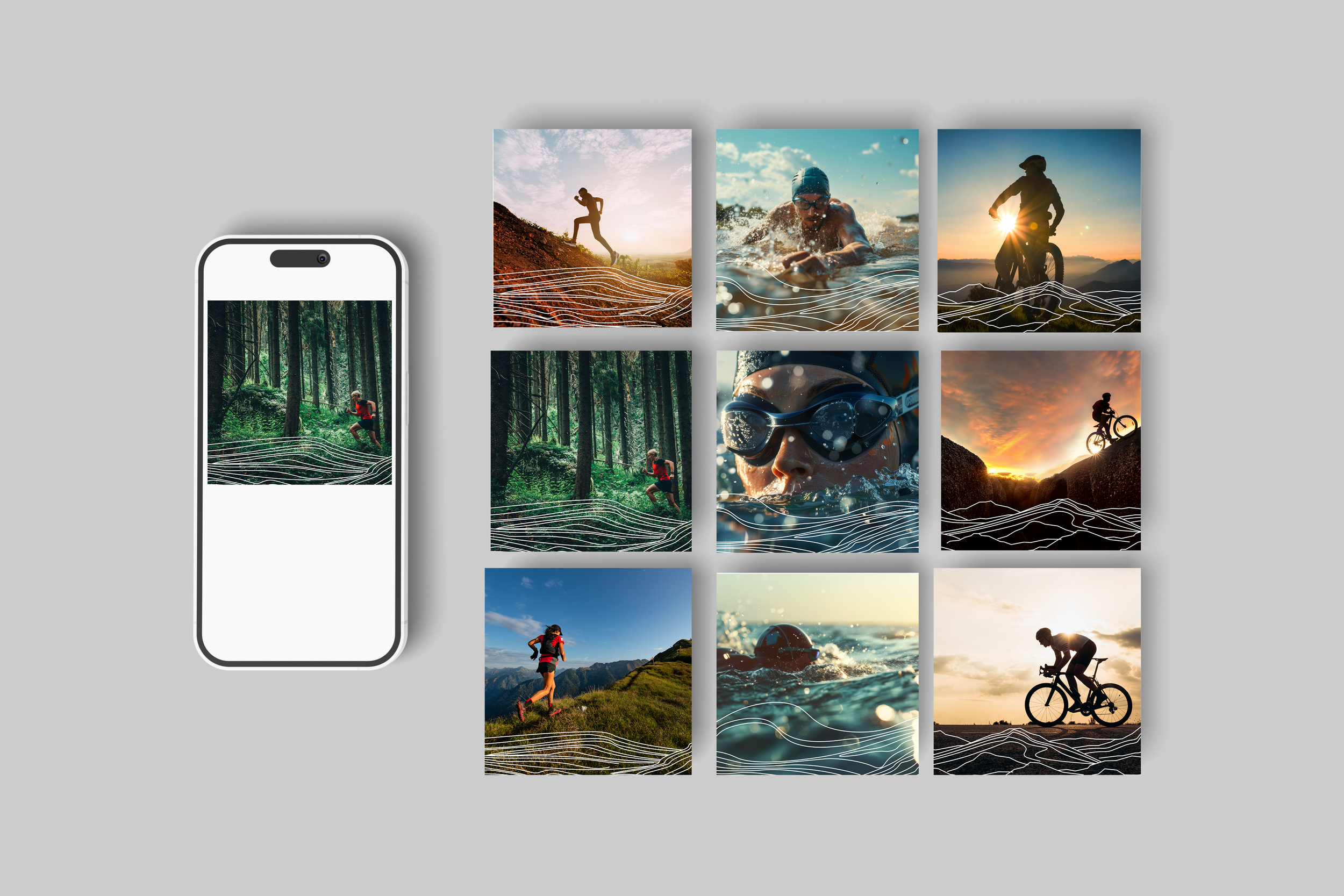
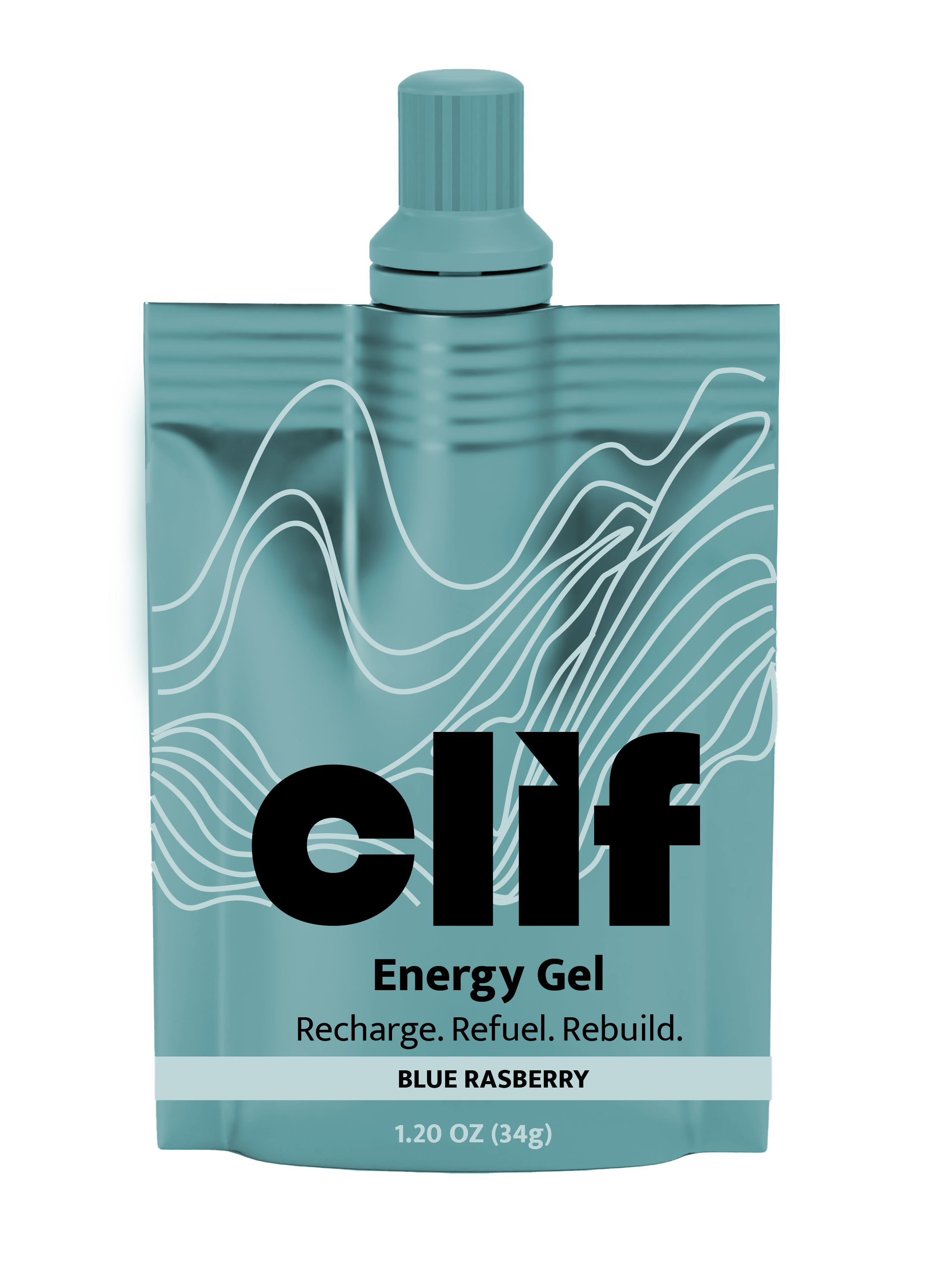
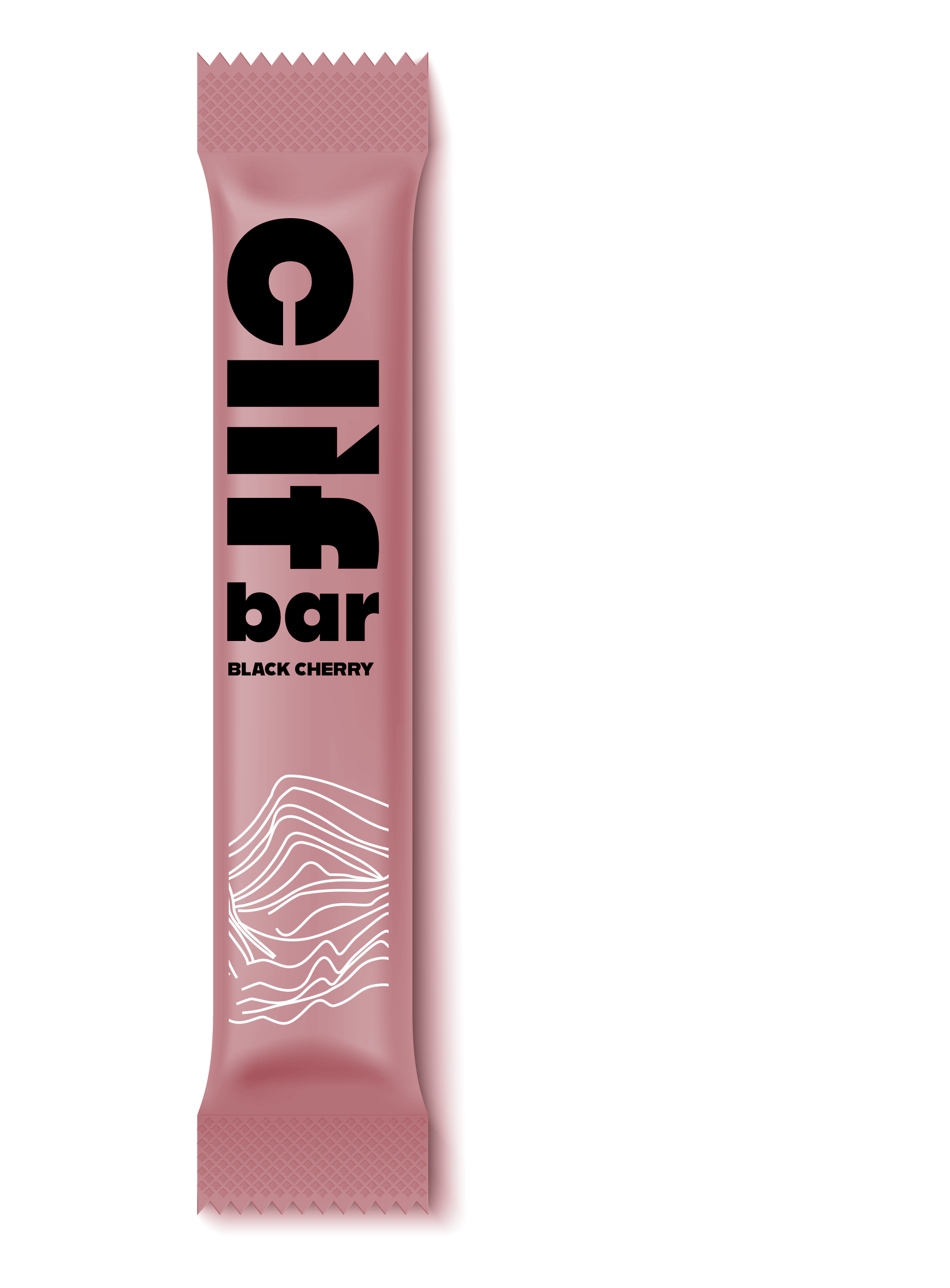
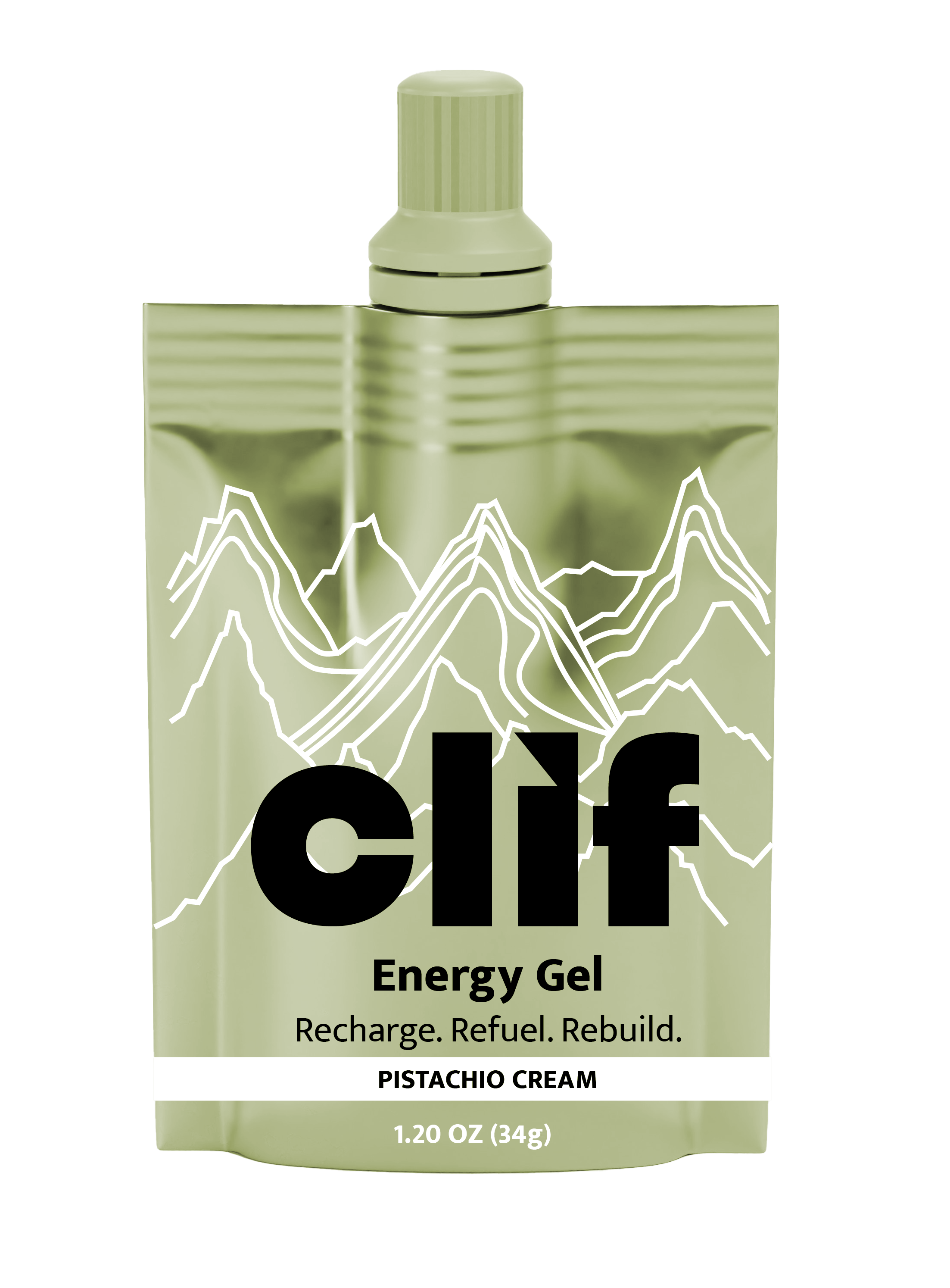
I chose to rebrand Clif with a fresh new take. I wanted to restore the brand’s history and origin by focusing on the endurance athletes. Clif was made to fuel athletes who train for long distances for long periods of time. It’s the delicious energy source specifically made for them. Every ingredient had its purpose. My goal was to position the brand to highlight the athlete.
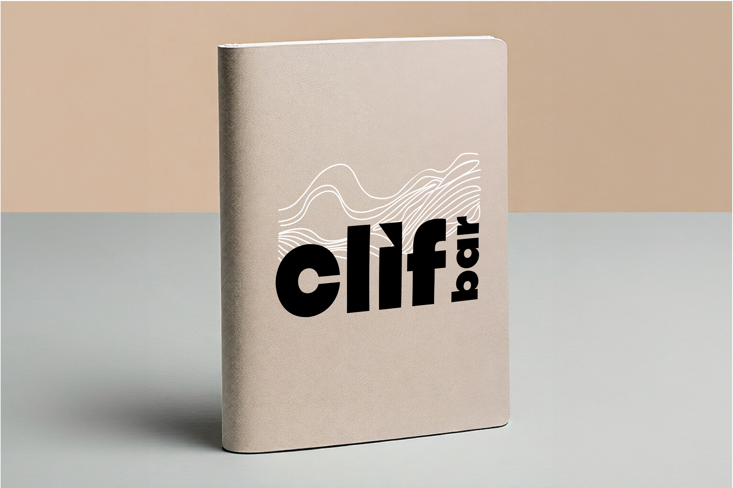
I redesigned the logo with a hidden arrow in the “I” to show progress, intensity, and growth. I chose a bold typeface similar to the original, and clear to read. I also changed the direction of “bar” to increase readability. I changed the colors to a more natural, earthy palette. I also included some fine line illustrations of the trails, oceans, and mountains to show the athlete’s terrain. Overall, this project was challenging, but I believe that my final solution was successful.